
There are a few VFX shots left to complete for this project and before I tackle them I thought it interesting to dive into how it has been done in the past. Presenting text messages on screen for the viewer to see has always been a sort of clumsy practice. It is difficult to show the text on screen without just showing the phone screen which is functional yet not very interesting at all.
Written communication in general has always been puzzling for film. It is difficult to display it in an interesting way that is engaging and doesn't kill the pace. If a director chooses to just point the camera at the physical object or document and lets that sit on screen for while it slows the pace down, isn't very visually stimulating and eliminates the possibility to simultaneously tell the story/show the characters reaction.
This became difficult too when mobile phones became a pivotal part of the modern age and as a result modern story telling in film. This is even more complicated than written communications on paper to display as it is dealing with a small uninteresting screen with a boring font. A large document can also at least be panned across by the camera whereas a text needs to be physically interested with and scrolled through which can be clumsy and not cinematic.
Many different directors have tackled other ways of displaying texts on screen. There are a lot of ways of going about this with varying levels of intricacy and intrusiveness. The first method to really work and change the formula was introduced in the BBC series of Sherlock. This show took the text message conversation and displayed it in a motion graphics style next to the character:

It is clean, simple and clear but also visually and aesthetically pleasing. The frame can be composed in such a way as to allow the text to become part of the scene and actually add to the visual punch of a scene as demonstrated brilliantly with this example:

Here the text takes centre stage and is framed beautifully. Importantly though, from a storytelling standpoint, you get the information being written/read alongside the actors performance. You get the impact to the story both through reading the information and also by gauging the characters reaction to it simultaneously. This method quickly took off being used by directors across many genres.

In the above frame the text conversation is displayed within a 3D environment with a lot of colour and imagery. This is within the context of a comedy where the images and the style of the text bubbles fit in with a more goofy environment.

Above is a more stylised version of a similar style. Here the conversation is hand drawn and floating freely. This is set within the context of a romance and so the style again fits.
Maker of Men is a drama though so the above styles aren't really appropriate a style that is very nice however, is the style used in the Netflix series House of Cards.

Written communication in general has always been puzzling for film. It is difficult to display it in an interesting way that is engaging and doesn't kill the pace. If a director chooses to just point the camera at the physical object or document and lets that sit on screen for while it slows the pace down, isn't very visually stimulating and eliminates the possibility to simultaneously tell the story/show the characters reaction.
This became difficult too when mobile phones became a pivotal part of the modern age and as a result modern story telling in film. This is even more complicated than written communications on paper to display as it is dealing with a small uninteresting screen with a boring font. A large document can also at least be panned across by the camera whereas a text needs to be physically interested with and scrolled through which can be clumsy and not cinematic.
Many different directors have tackled other ways of displaying texts on screen. There are a lot of ways of going about this with varying levels of intricacy and intrusiveness. The first method to really work and change the formula was introduced in the BBC series of Sherlock. This show took the text message conversation and displayed it in a motion graphics style next to the character:

It is clean, simple and clear but also visually and aesthetically pleasing. The frame can be composed in such a way as to allow the text to become part of the scene and actually add to the visual punch of a scene as demonstrated brilliantly with this example:
Source: https://thegreatworkbegins.files.wordpress.com/2013/03/screen-shot-2013-03-08-at-2-23-26-am.png
Here the text takes centre stage and is framed beautifully. Importantly though, from a storytelling standpoint, you get the information being written/read alongside the actors performance. You get the impact to the story both through reading the information and also by gauging the characters reaction to it simultaneously. This method quickly took off being used by directors across many genres.

In the above frame the text conversation is displayed within a 3D environment with a lot of colour and imagery. This is within the context of a comedy where the images and the style of the text bubbles fit in with a more goofy environment.
Source: https://rachelmarsdenwords.files.wordpress.com/2014/11/screen-shot-2014-11-05-at-11-16-07.png
Above is a more stylised version of a similar style. Here the conversation is hand drawn and floating freely. This is set within the context of a romance and so the style again fits.
Maker of Men is a drama though so the above styles aren't really appropriate a style that is very nice however, is the style used in the Netflix series House of Cards.
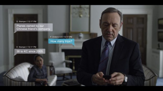
This is a beautiful way of displaying text messages that echoes the design ideas present on the actual device itself. It is really nicely composed and has a clear indicator as to who's said what.
It is an interesting thing to look into as there are a lot of ideas floating around but Sherlock started the most effective way of going about displaying written communication for the digital age. This style has been adopted in both film and television alike and it a perfect medium for displaying text messages.
No comments:
Post a Comment