Labels

Showing posts with label Professional Practice. Show all posts

Thursday, 4 June 2015

Employers to Promote Myself To

I am going to use this blog post to showcase potential employers that I am going to promote myself too. These are employers that fit within the industry I want to work in and who I feel my skill set lends itself towards.

Scorch London:


Scorch London is a production company based in London. Who have a very extensive and hugely impressive list of clients:


They produce everything within the video sphere from adverts to motion graphics, they handle the lot. This would be a great company for me to be a part of and to recognise my work. My style suits theirs I think and the all-encompassing nature of their products fits with my work ethic and ethos.

I am well versed in all aspects of video now and this company seem to thrive through diversification. That is something that really interests me and something that I think will keep the job interesting and fresh. 

Liquid Productions:


Liquid Productions are another company similar to Scorch. They are a ubiquitous all-encompassing production company again with a hugely impressive list of clients. They appeal to me for a similar reason as Scorch. Their work is of a very high standard and the sheer variety of things they produce fits with my ethics of production.

The min thing is to not feel pigeon holed or have too much of a repetitive aspect. I think a production company like either of these two would be a great place to work as the sheer variety will inject interest and validation.

Also they produce incredibly high quality products and that would bring with it a strong sense of pride, achievement and teamwork.

These are definitely two options to advance with.

Final Portfolio Site

Here's the link to my final site:


So I have finished the changes to my site. It hasn't come too drastically far from it's initial look but it works a lot better now. The whole site looks a lot cleaner and nicer as a whole and there is more unification overall. It is more user-friendly, better to look at and more intricate. Everything I have added are really just finishing touches and I am much happier with the whole site now.

Given some time over the summer I will tweak it a little further, hopefully adding an actual contact form, and also updating the content to my latest stuff.

All in all though I really like my site and I think it looks and feels a lot better than a vast majority of other sites out there in the similar field.

Contact Into

I couldn't find any contact forms that really fit my aesthetic and it would be very time consuming to make one so for now I have just placed some simple information in the footer:


I like this addition as it is incepting with the sites styling and the link, when clicked, will open up your default email application and start a message to that address which is really sophisticated.

Favicon

I couldn't figure out last time how to add a favicon but after a bit of research and some help from a friend I got it down. The favicon I chose was just a simple red square in the same colour as is prominent throughout the site. This strengthens brand identity and just adds little life into the address bar. Here's it all finished:


I think it's a really subtle, nice touch and something that is way overdue.

Gallery Changes

The gallery is one of my favourite parts of my site. I think it looks really strong and makes my work shine. I didn't want to change anything substantial just update an effect that I felt wasn't really working. The effect in question was the hover effect. When hovering previously the key colour over wrote the image. Like this:

Idle:


Hover:


This looks good and really fits with the style and theme of the website as a whole which works well. However, the fact that hovering over the image and having it completely vanish isn't a very clever design choice as it makes it so the art disappears. To fix this I simply added a border to all the images and had the colour appear onto the border as a hover effect:

Idle:


Hover:


This still has all the clarity and stylistic impact as the previous effect however, now the image remains visible throughout the hover and makes for a more consistent and less jarring viewing experience.

Navigation Changes

The navigation for my site was tricky. Back when I first made it I couldn't get it to work sitting under the logo so I locked it to the bottom of the page. I knew this wasn't the right move but it was a quick fix. So I used this as an opportunity to revisit this aspect and get it how I wanted it. This is how it looked:


So I moved it to the top of the page underneath the logo. This is the conventional place for the navigation to be located which as a result makes my site as a whole far more navigable. I also re-styled it pretty substantially. I wanted a cleaner more elegant look to the navigation. This is the end result:


I also think that this looks a lot nicer too. It is clean and gives the logo itself a little more character. Once other thing I wanted to do was fix a glitch that had been bugging me for a while. That is that when you go to the mobile size and open the navigation then move the page back out the mobile navigation stays underneath the main nav. Like this:

The menu at mobile level:


When the page has been scrolled back out to desktop size:


So I went into the code and added this:


And with that the problem was solved. This little bit of code ensures that the mobile navigation cannot be visible at any size above the size that it becomes viewable. It was a quick, simple fix that works really well. So with that and a bit of styling the mobile navigation went from this:


To this:


Again this styling makes it fit in a lot better and I think that it is a lot clearer to use now. I think overall I have really improved the navigation capabilities of my site just through these changes.

Analysing My Own Portfolio

So here is my current portfolio:


I am still really happy with it to be honest. I really like the design and principles overall but there are definitely a number of factors I want to change. I am still really happy with the colour scheme. I think I am going to keep that the same.

The typography is still something I like. I may address the logo at the top as it doesn't quite work for me anymore so I'll need to look at that.

I need to add in a favicon to the address bar just to keep up with brand identity. And also I think that I want to move the navigation system to a more conventional position underneath the logo. I'm not 100% sure of that decision but I think that it will make my site more instantly navigable.

Other than that I really like everything to do with my site and don't want to change too much.

As I mentioned in the last post I really like simplicity in portfolio design. That was the main thing I had in mind whilst designing it in the first place. I thought about it from a clients point of view. Since I want to be a pretty flexible artist I wanted to showcase both my video and design skills in equal measure as concisely as possible.

Everything was to be as straight forward as physically possible. The first thing seen on the page is the logo which details my name and what I do. Then the main thing to attract the eye is the showreel. It is clearly labelled and very inviting to click on. 

After that is a simple box with my social links and then finally there is the sites main navigation. Everything makes sense and is displayed as simply and cleanly as possible. This gives a god indication of my design sensibilities and also I think invites potential clients and employers to be able to quickly and easily summarise what I can do and get an idea for my style.

So in summary I want to change a few aesthetic points and also maybe address some aspects of the structure. If I have the time and can find the right asset I would also like to incorporate a contact system into the site but I'm not sure I'll be able to do that in the time limit and make it look the part.

Existing Portfolio Research

Before I look at my own portfolio I thought it would be good to look at existing portfolios and weigh up what they do well and what they maybe misstep on.

Dan Moran:


This is the portfolio for Dan Moran, a professional colourist based in London. It is a really impactful site. The images leap off the page and grab your attention. I like the layout and structure but the main thing that I like is the clearness of everything. The design is a little too modern and complex for my taste. I like more traditional clean styling. But how clear the site is to navigate is a great success.

This is my problem with modern web design though is it's flashy design, for flashy designs sake. The modern way of designing the look for a website has made most well-designed sites look the same. Big blocky and fullscreen. I don't like that look and I think it's unnecessary. An example of that is this menu system from Dan's site:


I think it's just flashy for the sake of being flashy. There is very little design ethos that went into that decision. I think it really detracts from the success of this design. And that's my problem with modern design. Animations and full-screen effects look great but only when done to an exceptional standard are they worth including. When they encourage play and engagement then they are successful when they are just there they do the opposite and become a faff.

David Wright:


This is the portfolio for David Wright, a Director of Photography based in London. Now whilst this site isn't quite a visually stimulating or flashy as other sites on the internet I really prefer it's styling. It's simple, concise and clear. There are no flashy animations or outright effects it is straight to the point and clear.

At the end of the day your portfolio site is for potential clients and for use in securing job prospects. In that regard the site itself is just a means to showcase your skill set and work. A simple site that doesn't get in the way of that task is really important in my point of view.

A site that moves around and is hugely over-designed comes across in the same way to me as a site that is over-compensating for something. Dan Moran's site is not a real showcase of that mentality mind you. I actually like it's clarity and the design is appealing with only a few effects. I am talking more about the overall mindset that seems to be engraved in modern web design. For me simplicity and classic design principles are all that matters.

Tuesday, 2 June 2015

Career Practitioner - Corridor Digital


Corridor Digital is a production company comprised predominantly of Sam and Niko. They create videos primarily for display on their YouTube channel (https://www.youtube.com/user/CorridorDigital). They mainly produce shorts based around specific ideas and concepts that tie into video games and pop culture. They are hugely successful on YouTube having amassed millions of subscribers.

They are on the forefront of a new direction being forged within the filmmaking industry. A purely internet based production company that specialises in creating relatively inexpensive short pieces with the intent of going viral. They have often been sponsored by major companies and products to produce videos for them.

It really is a new wave within the industry that does away with the traditional format and the profile of television. Using platforms like YouTube and Vimeo they can reach a truly global audience. The internet is such a ubiquitous medium that their content can be instantly linked and embedded within articles or blogs and shared millions of times within a few days.

This is a new way of creating and sharing filmed content and what's more it is relatively inexpensive and realistically achievable. It's all about the bedrock of the content and the basic principles that go into capturing. Keeping the team that makes the content small allows a clear vision to shine through and keeps the content really tight and focused. There aren't any big corporations telling them what to make and how to make it. This allows them to often go with quite a whacky idea and commit to it fully.

It is a really liberating new way of creating video and something that I aspire to. When I talk of being an aspiring filmmaker this is the avenue I am seeing to pursue. This method of content creation is achievable and sensible and truly modern. It is a service almost every business or product requires no matter the scale. It is truly flexible from creating adverts to narrative pieces to music videos it all follows the same blueprints of being made for the internet.

I think that Corridor Digital are one of the best examples of how to conduct an internet based production company and a style conducive to the target output. Their videos are always top quality attracting millions of views and being talked about world-wide. Their content has the polish come to be expected from Hollywood and is made on a fraction of the budget.

I will leave you with one of my favourite videos of theirs that shows what they can do when given a budget and how they go about advertising a product:


Their links:

Monday, 1 June 2015

Career Practitioner - Gustavo Santaolalla


I don't know how much more I can say about this man. I've said pretty much all there is to say about him in multiple previous blog posts. I'll keep this short for that reason. He has inspired me artistically more than anyone else I can think of. The music he creates connects with me so deeply and I hope to replicate the feeling I get when listening to his music in all the projects I produce.

He has worked on a myriad of feature films, personal albums and now video games and always brought a hugely soulful and emotional presence to everything. His music connects, deeply and immediately form the first listen and that is an astounding achievement.

His work on The Last of Us was incredible and really brought the game to life for me. His work on that game will stick with me for years to come I know. To reiterate I've said all I can say about him really, I cannot praise him enough. So I'll leave you with some of his work and some links where you can find more from him:


He doesn't have any professional links that I can find but a quick search on Google or YouTube will return a lot of information about him along with his music. I will just leave you with a link to his IMDB page:
http://www.imdb.com/name/nm0763395/

Career Practitioner - Rob Krekel


Rob Krekel is a sound designer based in California. I first came into contact with his work in the video game Uncharted 3. He produced a lot of the sound assets for the game. Naughty Dog (the company that made that game) have always had a soft spot with me. Their games are head and shoulders above any other game in my books. They consistently knock it out of the park.


Their sound design has always been good but it has got progressively better and better in recent years. The sound in all of the Uncharted series of games has always been amazing and it took another giant leap forward in The Last of Us. The sound in those games is half the experience of playing them. It is all about subtlety. More than any other game developer they focus on the details and make them have such life and character. The way the world sounds just in idle is phenomenal and the noise of footsteps and interaction with the world just brings their games to life with such realism.

Rob Krekel is one of the sound designers that worked on these games and his work has really caught my attention. He has also worked with some online filmmakers I watch, namely Film Riot and Corridor Digital. This is where his work really stands out for me. I am familiar with filmmaking as a process and I have watched these channels since their conception and they were shooting on DSLR's. The image quality has jumped up now substantially. Along side that though the audio has really come a long way. This is thanks to the work that Rob Krekel hasten with them. This is one of his latest pieces with Film Riot:


The sound in this film sounds professional. It sounds like a $1,000,000 feature film. It really helps to sell the effects and the story adding palpable weight and suspense to every moment that requires it and comic relief at other times.

His work sounds amazing and he is someone that has come up in a similar way to a way I could see as possible for me. He is a beacon of direction for me and his pathway into the industry is something I've looked at and want to try to replicate.

Here's his links to find out more about him:
https://twitter.com/robkrekel
http://www.robertckrekel.com

Career Pathways - Sound Designer


This is another recent love of mine. As I've mentioned before I've been an aspiring filmmaker for quite a while now and the one thing we always said we lacked was decent audio. So a little while ago I saved up some money and bought some professional equipment. With this the aim was to up the audio quality in our productions and make the films better as a whole.

After purchasing these items I began researching sound design as an art form and quickly got enthralled with it all. It is a great profession that adds so much life and depth to the story. Audio for me is more important than the visuals as it adds such a tangible texture and intensity to whatever is on screen. It is the backbone of any video of any scale and often goes completely unnoticed to most. That's what makes it so extraordinary. It is a hidden art form that completely forgotten about yet absolutely essential.

Sound recording as a job is a pretty varied bag. You can find yourself in a whole cornucopia of different scenarios. The post sound side is what interests me most though. Foley recording and gathering assets for use in games is something that I really want to do. That is where the artistic flare and creativity comes into the affair.

When recording audio on set, as I've mentioned you are only focussed on recording the dialogue and it's all about getting clean dialogue takes. In post it's all about creating noises and textures and filling in gaps. It's about thickening the experience.

Now I don't have masses of experience in the field but I do have a few key and unique skills. For one I know the filmmaking process from a visual side very well. I think that this really helps me have an inbuilt compass when it comes to storytelling and imagery. This helps me inform my decisions when it comes to audio. Also I am familiar with what editors require (audio wise). This makes me able to export out something that meets their requirements and sometimes even more than fulfils their needs. I know what I would be wanting if I was editing and so I can export that out myself for them.

I am fascinated by the sound recording process for video games too but I don't have any experience with it unfortunately. That is definitely something I would love to try out at some point though.

Career Pathways - Scoring for Games and Film


Now this is something I am brand new to. I have only really dabbled with it in the past and my most complete fore into the process was very recently in the work I did for Maker of Men. That was my first time purposely writing and recording music for a set goal.

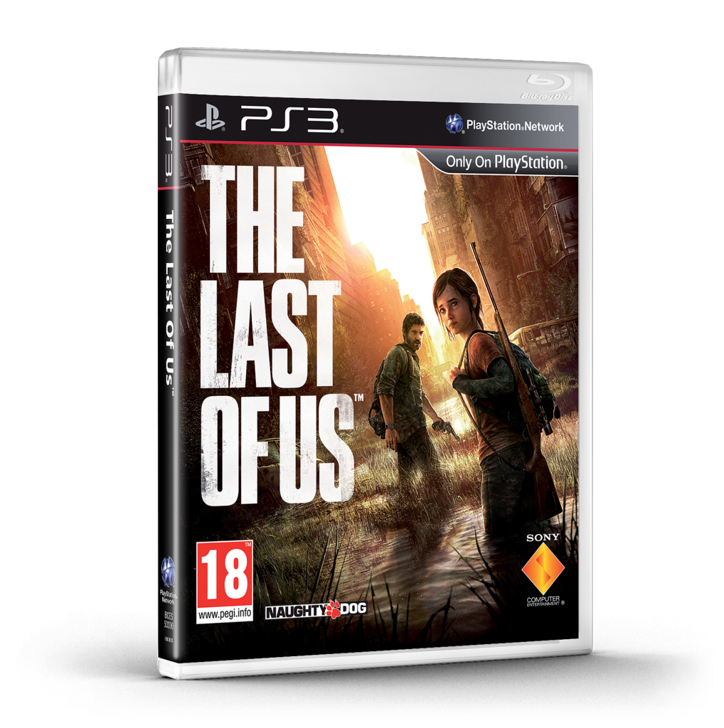
The reason I have put this down as a career path (even though I don't have any experience and haven't dabbled with it before) is because it is a love of mine. Recently I played a game called The Last of Us. 


It was a breathtaking experience. I loved it more than any film or TV show I've ever seen. I got completely enveloped in the world, the story and the characters more so than with any other medium before. So many images and ideas from the game have stuck with me since playing it and the experience and feeling I had whilst playing it for the first time is something I hope to never forget.

One thing that has stuck with me more than anything though is the music. It is absolutely stunning. It is haunting and foreboding whilst being beautiful and minimalistic. It is all the work of Gustavo Santaolalla.


Now I have mentioned him on this blog a huge amount but that is for a good reason which is that his work has inspired me more than virtually anything else I have heard experienced recently. Music as a whole has always had a deep connection with me and I have always loved it but his work was something else. From the first time I saw the trailer for The Last of Us it gripped me.

So when I put this down as a career pathway it is more of a dream than anything else. Working in the way Gustavo works and creative music of a similar style would be something I would love to do. I have limited expertise or experience in the field but it is something I can see myself devoting a lot of time and effort to in the future. It is something I will always be dabbling with in the background and hopefully I can one day get close to the level he is on.

To experience what I mean when I talk about his music listen to any song in this sound track. It is all completely astounding:

Career Pathways - Motion Graphics Artist


Motion graphics is another big passion of mine. I have thought of working in this industry for a long time. It is similar to the editing sphere in the sense that it is generally quite specialised. Most motion graphics artists specialise just in something like After Effects of a 3D package and rarely step out of it.

Motion graphics are everywhere at the moment. It is a booming industry. What with the advent of services like YouTube and Vimeo showing the popularity that they are there is more demand than ever for high quality motion graphics. What's more they are relatively quick and inexpensive to produce and can have a very powerful impact.

When filming something physically to display a message it is time consuming to get the to the location, get the shot, get back, edit it together, add a voice over. It takes time and quite a lot of money. Motion graphics on the other hand is relatively instantaneous and a lot less time consuming usually. This is why we are seeing such a surge of fully animated pieces all over TV and the web. Think of the adverts companies like BT and Virgin have been putting out of late. They are all completely animated without a single piece of conventional filmmaking.

Having said that I think that my filmmaking background and skill set is a really useful asset for me here. The fact I know how to shoot things and can comfortably use programs like Premiere Pro and Audition make it so I would be a pretty complete package. I can film and edit a piece then add sound then even incorporate motion graphics over the top.

An important aspect here is that I have been on both ends of the procedure. I have created motion graphics for use in different projects with exact requirements and I have had to use motion graphics in projects of my own.

This insight gives me the skills to be able to tailor my creations and outputs for the specific outcomes. I know the problems that people will be facing in the editing environment and I can counter them first time in my work before they become a problem. I can also keep the motion graphics work in house for a company saving costs massively.

This industry also looks like a lot of fun. It is highly creative and as a result often leads to really creative, interesting people working within it. It also lends itself to a fun, flexible working environment.

It is definitely an industry I am excited to look into further.

Career Pathways - Editor


One of the main career paths I have been thinking about for a long time is the position of an editor. I feel as though I am really well equipped for this role. The world of professional film/TV/video post production is a very diversified one. People often specialise in one particular part of the industry and don't often venture outside of their chosen avenue. For example an editor typically will use one piece of software to simply edit footage and then send their edit off to be colour graded and to have visual effects added to it. This will be handled by other people and often even outsourced to other companies.

This is common practice within the industry and something that has come to be expected. This is where I think I have an edge. I not only know how to use Premiere Pro (which is an industry standard editing package) I also am well versed in After Effects and even programs like Cinema 4D.

After Effects and Cinema 4D are programs that are complicated and will often have to be outsources for work however, I feel like I know how to use them to a pretty professional standard and so I bring that to the table of any editing position as an extra string to my bow. I can create motion graphics and carry out an array of visual effects techniques. This gives me a unique selling point.

I would prefer to work on films/music videos. Also narrative TV series would be really good. Ideally something that I can get my teeth into and tell a story with. That's the dream and why I got into filmmaking in the first place. I want to tell stories. Editing corporate videos or lowest common denominator TV shows would still be great as I'd be editing but ideally editing meaty, engaging narrative pieces would be a dream come true.

After looking into jobs in the industry as well a lot of them encourage working from home which is ideal for me. I know the colours my monitor puts out and I have a streamlined workflow here and that would help me work quickly and smoothly. I could also keep down travel costs and other expenses.

This is definitely a career path I am looking into heavily and one I think I am well skilled to pursue.

Professional Practice Pt. II

With the independent project complete I now am shifting my attention to the professional practice brief we have to look at. I wanted to save this until last as it should be a really helpful brief to focus on at the end of the year. The purpose of this brief is to research clients and job opportunities. 

I knew that the independent project was going to allow me to dabble in new areas of work and some of them might be careers I would like to pursue and so I thought leaving this project until last would be a sensible choice. I think I was right in that decision.

Wednesday, 25 March 2015

Final Animation

So here it is the final animation:


I am really, happy with how it turned out. As you may be able to see in the left hand jars I added a lot more movement and interest to accompany the movement and interest join the right hand side. Notice the lightning moving and the blue background swirling.

However, most importantly I think, the sound really ties everything together. As I mentioned in the previous post it is simple, elegant and hand made. Everything feels small and familiar, not intimidating and huge. The sound really suits the style and works to bring out every independent element it accompanies. I think it works really well and I am really happy with this as a final product.

Adding Sound

I was a bit puzzled by the sound for this piece. I started by adding in realistic, serious sound effects but quickly realised that wasn't right for the feel of the animation. And so I took inspiration from the feel I'd created and went with more of a handmade, childlike, simple soundscape. When I ran those words through my head one thing came up. A music box. They optimise childhood and hand-made, cute craftsmanship so I thought it perfect for the style I wanted to create.

I settled on a music box song that I found online and then added some whooshes from a motion sound effects pack I have. Along with that I added some subtle mechanical to accompany the ending. I wanted everything to feel small and personal and done by hand. Nothing must sound too big or intrusive. Every sound is natural and subtle and I think that it all blended together to make an amazing soundscape that I am very proud of. It is withdrawn, simple and pure and evokes all of the emotions I wanted it too really powerfully. I'll post it along with the finished animation in the next post.

First Draft of the Animation and Changes

So I finished the animation and rendered it out in full-res for the group to see. This is it:


Everyone really liked the style, the movement and everything to do with how it felt. They just had a few suggestions concerning some of the finer details.

Jake's comments:


Jess's comments:


So there were two issues. The movement was too quick and the left side didn't have enough movement. I agreed with both of these statements and had a couple of things I wanted to fix myself.

So I slowed the camera move, added interest and movement to the left hand side and also changed how the title it revealed at the end (because I thought the page turn looked a little cheap and amateur after repeated viewings).

I'll post the finished result later because I went straight to adding sound to it and I want that to be another blog post but I am very happy with the outcome.

Creating the Title

I decided to have a stab at creating a title to go on the end of the animation for everyone to use. We wanted a brushy, script font that shared all the values we wanted to display and so I went through my font libraries eventually finding one I liked. I put it on a simple background and just tried it out being bright pink and I think it really worked. This is what I ended up with:


I think that it's impactful, childlike, cute and fun. All the values that the animation as a whole represents.