
I have decided to take a little break from working on the film itself to begin work on the poster idea I've had. I think a little bit of distance and time from the music and the actual moving image will do well to recharge my batteries and help me to see it objectively in a new light and so I am going to try and get going on a poster design.
Jamie was keen to stress that the films supernatural, darker ending should be a surprise. The film, for the first half, looks and feels like a romantic drama with a strong light-hearted core. The marketing should aim to highlight and show it in that light. That way the film will seem like a happy and easy going one until the half-way mark hits and then it will take a turn.
This was something he was passionate about even down to how it was edited, coloured, shot and scored. This is something that I want to incorporate into the marketing material. the film should still seem dramatic and grounded but not necessarily dark and supernatural.
I was careful to make sure that the marketing didn't go too far in the other direction though. I shouldn't create marketing material that makes the film look like a lovey-dovey romantic comedy. There needed to be grit and dramatic connotations.
With all this in mind for some reason my mind was drawn to ink on paper as a concept. I don't know what initially made me think of it but for weeks now that's all I have imagined. I really like the idea and imagery that goes along with that style a quick Google search reassured me that it was definitely the style to go with.
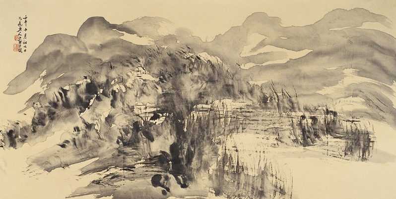

Source: http://1stikon.com/wp-content/uploads/2014/05/S2.-Again-in-His-Light-25x40cm-ink-on-paper-2013.jpg

I adore the style of these images. I love the way that ink has a tendency to bleed over into the paper and fade in and out of existence. It can be used to construct shapes and ideas without actually explicitly outlining them. This is quite a deep connotation to the film where the hidden motives and themes are hidden and obscured and then fade into view.
Another tie to the themes in the film is the idea of ink in water being akin to blood in veins. The film is about a disease being transmitted during sex and for me the ink on paper and in water symbolises this process in an artistic way.
However, I wanted to bring this idea into the modern age and bring it to something a bit closer to my ability and so I wanted to pair it with film photography. This style is something very evocative and something that the director and I were discussing in pre-production. He said he wanted the the film to feel warm and lo-fi in a manner that only film can really achieve.
With this I wanted to incorporate the ideas film allows for within the poster design also. I am really excited to get going with it.
No comments:
Post a Comment